the first week is done
9/1/24

hi there! i said i'd write a new post a few days after august 28, but turns out i needed a few more days to rest. school starting was as much of a dumpster fire as i figured it would be. so much dumb stuff happened that i don't even really feel like talking about any of it. i'm just glad that i am (hopefully i'm pretty sure) switching out of my shop into another one. i'm very glad about it.
on a more interesting note, i've been dogsitting at my aunt & uncle's house this weekend, and the alone time has been awesome. i really like it :)
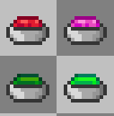
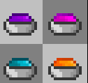
i've been working a lot on my minecraft texture pack these past few days. i haven't really gotten the chance to talk about it here yet, so i will now. it's a texture pack for the b1.7.3 mod called Better Than Adventure! it started off as small little changes like making the dyes little containers with colored fluids in them instead of weird color blobs. example below.
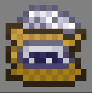
i also made some other sensical changes like making bone meal a bag of bone meal like it should be. (really proud of this one)
one of the main changes this pack makes is making the tools accurate to how they should look given the resources the player has. let me explain.

wood tools are very hastily and sloppily put together because the player doesn't have the resources or skills to fine-tune the tools enough at this stage of the game.

stone tools are a lot more clean-cut and sharp, because now the player has the resources to make them more refined like that. however, you'll still notice the grass and stick fastening on the tools, because the player doesn't have the resources to upgrade that just yet.

iron tools is where the player actually has the skills and resources to make their tools as efficient and useful as possible. notice the stone handles rather than wood. using wood sticks on metal and even diamond tools never made sense to me, so i feel like stone handles only makes sense here because the player just previously had access to stone.

this is one of the most interesting changes with the tools. diamond tools are "diamond tipped" rather than made fully of diamond. this is how diamond tools work in real life, because diamond--while very hard-- is actually very brittle, so iron is the base of the tool while diamond is the part actually doing the action.

as a bonus, gold tools (my personal favorite) have iron handles as well, because you need iron to mine gold tools.
you may notice that all of these early changes are all based on logic. this was the main theme of the pack at the time. i had nicknamed the pack "better than logical" as a play on the mod's title.
however, as this pack has evolved, it's become more of a tweaks texture pack, so the whole "logic" stuff was kind of just an after thought. here's a bunch of other items i've changed.

diamonds are no longer egg shaped.

sugar... i made it a little more color theory-ized
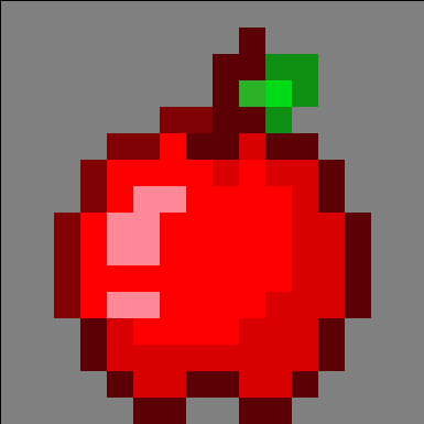
apple
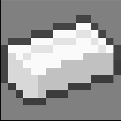
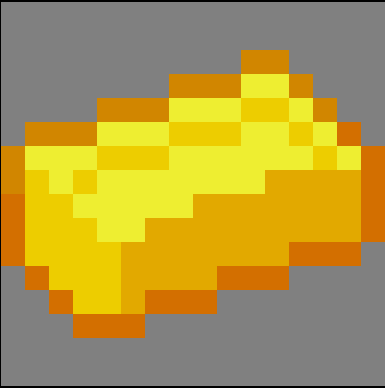
i made gold and iron ingots look less (or maybe more???) like butter and cream cheese.
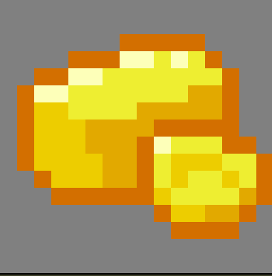
these changes applied also to raw gold.
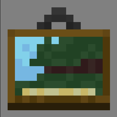
i changed the painting item completely... not sure if this better, but it's different. that's kind of the main idea of this mod. (although USUALLY i try to make it better than the real game textures
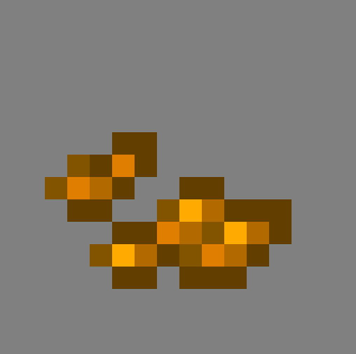
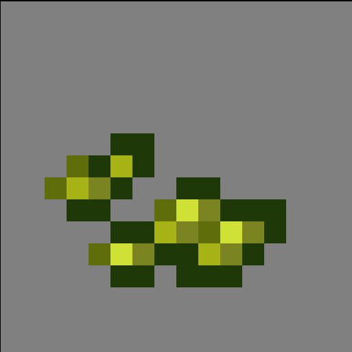
this is a change i'm super proud of. i made the wheat and pumpkin seeds look a lot more like their respective seeds. this just looks better than the weird colored squares they were before imo.
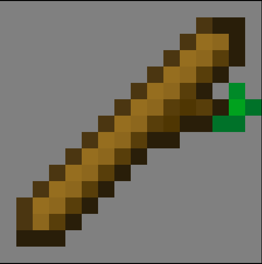
this is another really good texture. i made the sticks look like... NOT a brown line with an outline. lol.

this is the string texture. it's one of those changes that i'm not really sure if it's better, but it's different. i like the idea of the string being wound up like that.
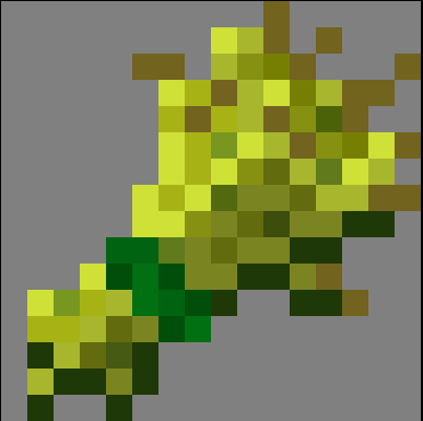
i made wheat have a green band tying it up.
those are by no means all the item changes, but all the ones i thought were notable enough to share. now let's look at some blocks i've changed!

this is one i'm very proud of, the diamond block! i was inspired by jappa's early redesigns for the diamond block.
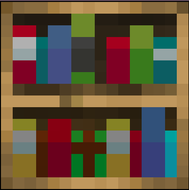
i changed the bookshelves to look less muddy and have better color theory applied to it.
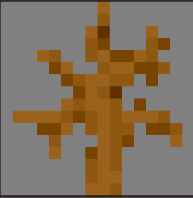
i made the deadbush have more and better colors.
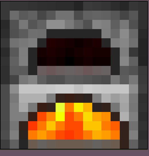
i made the furnace have better fire at the bottom, and a little heat glow at the top where the food/ores are cooking.
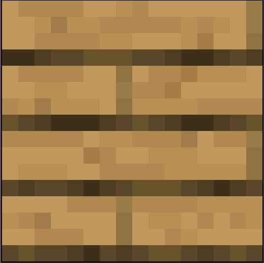
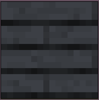
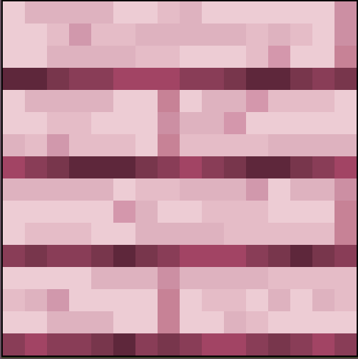
i made the wood planks have cleaner colors that don't clash as much. BTA has dyed wood instead of wood types. that's two examples of the dyed wood up there.
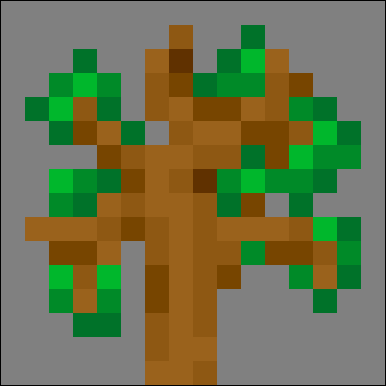
i made the sapling look less... "ew" i used the deadbush as a base and added leaves.
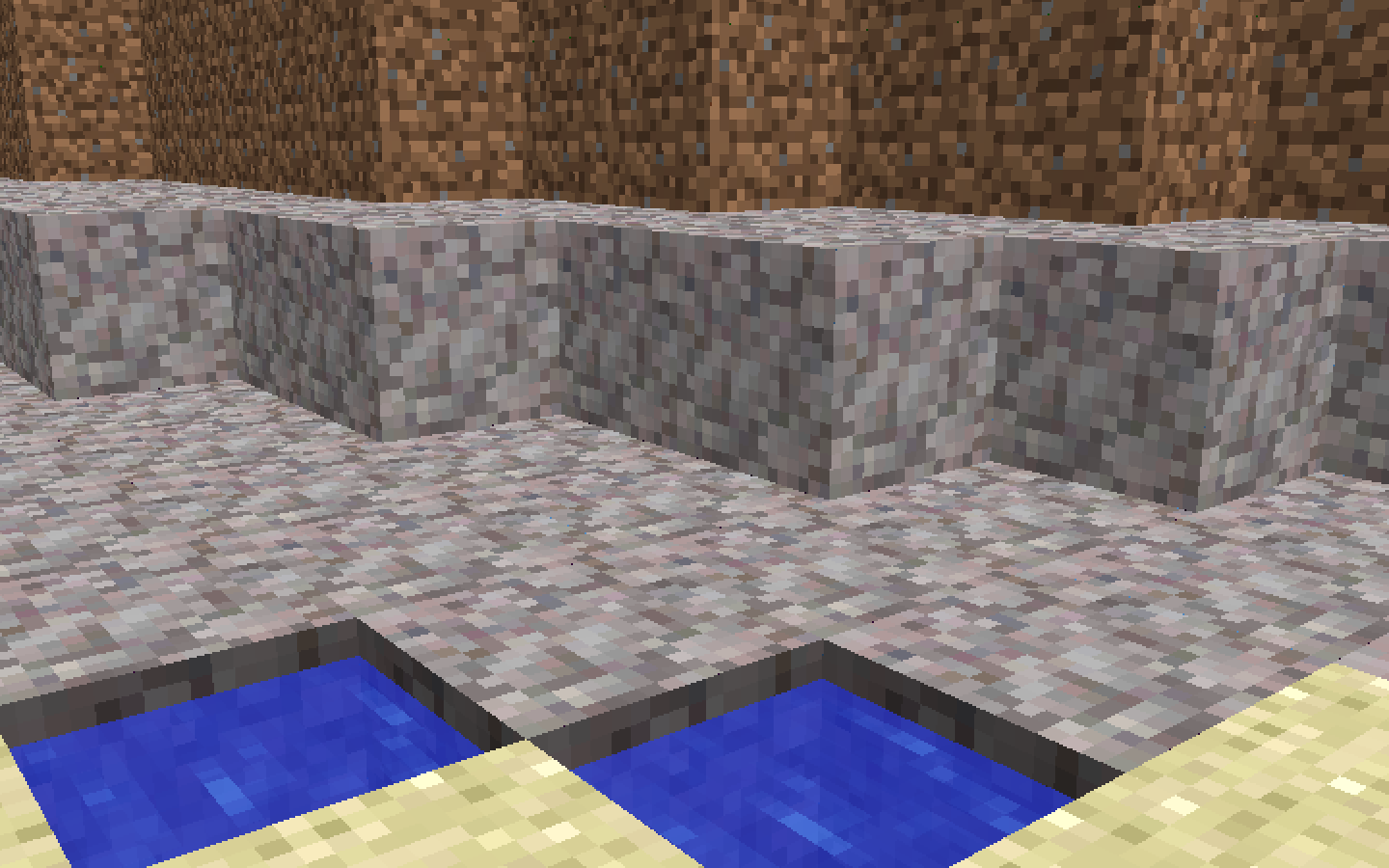
here you can see the new gravel texture. i really really like this one.
if you'd like to download this pack, you can download this current version here, on google drive. this texture pack is constantly changing, so i'll add a new link every time i talk about this pack on this blog.
that's all for now! have a good rest of your weekend, bye bye now :)
